Empathizing with users to address their needs and deliver a product that meets their expectations is at the heart of UX design. Potentially the biggest hazards to the user experience and the focal point of addressing user difficulties are ‘pain points'. For the uninitiated, user pain points are obstacles or stumbling blocks to completing the tasks or solving the problems your product is designed to address.
Identifying and addressing user pain points is an excellent way to begin to see some of the frustrations a user might have when navigating or operating a product or interface — this can be a really great way to inform the design process at any stage.
Remember: solving user problems is the most significant objective of UX design, if your design does not address their problems, you’re basically designing for failure.
There are very essential elements that have been discovered to be overlooked by designers these days. What are those elements? How do we Implement them? Follow closely as we explore the UX elements that are essential for users, but often overlooked by designers.
- Please make a U-turn
- Planning for a bad connection
- Please wait… still loading…
- Make the most of haptics
- Check, check, 1, 2, 3
Let's begin with,
- Please make a U-turn
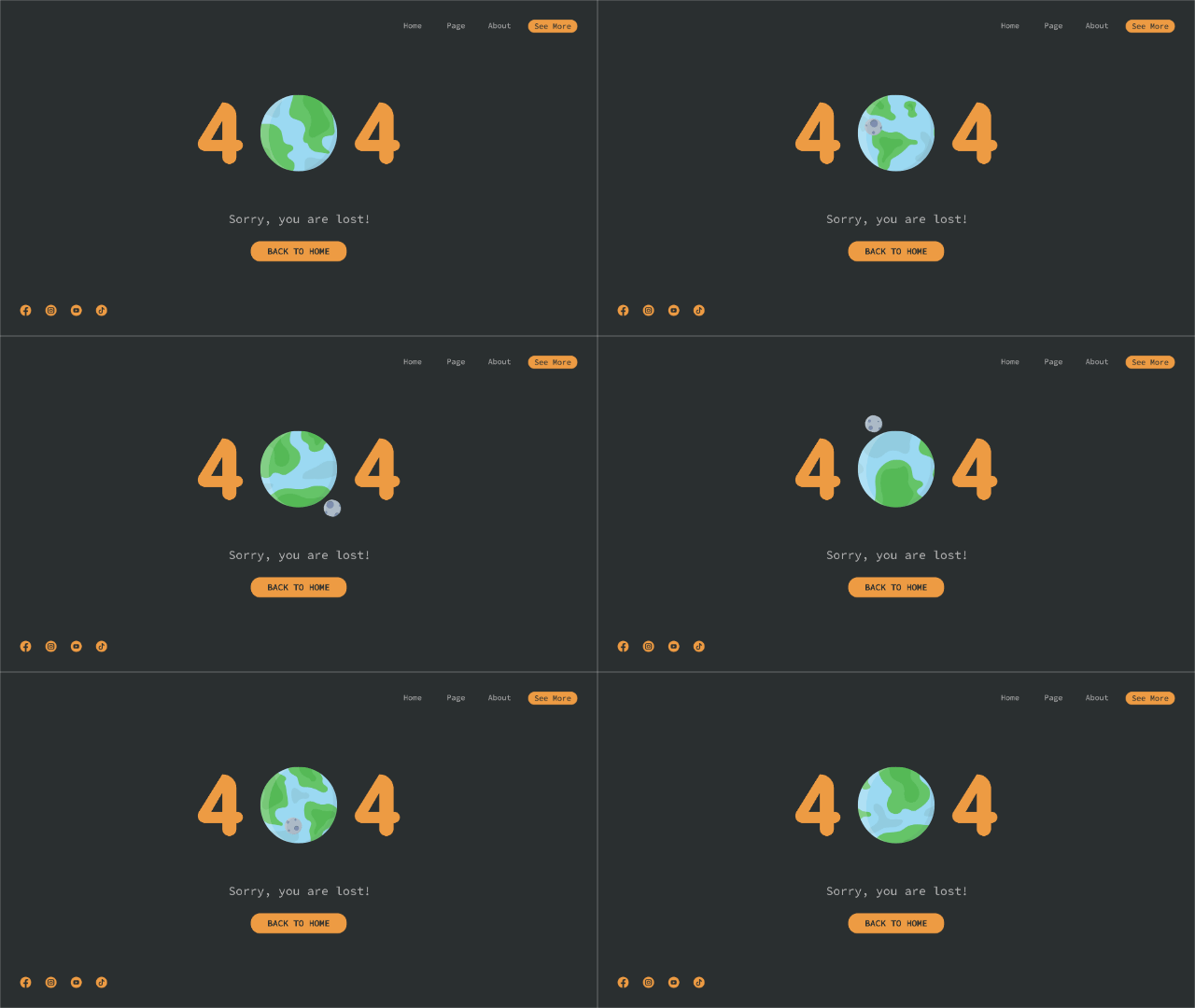
Another set of challenges is presented in helping users navigate through content to find something when they might not know what they want. They may follow a path we try to lead them down, or they might try to search and discover it for themselves. no-results page can help guide them in the right direction.

It’s helpful to imagine that your users are the type of people that would blindly follow their sat nav and drive into a lake. They need everything to be as clear as possible, so tell them what to do — as Headspace does in the above example.
- Planning for a bad connection
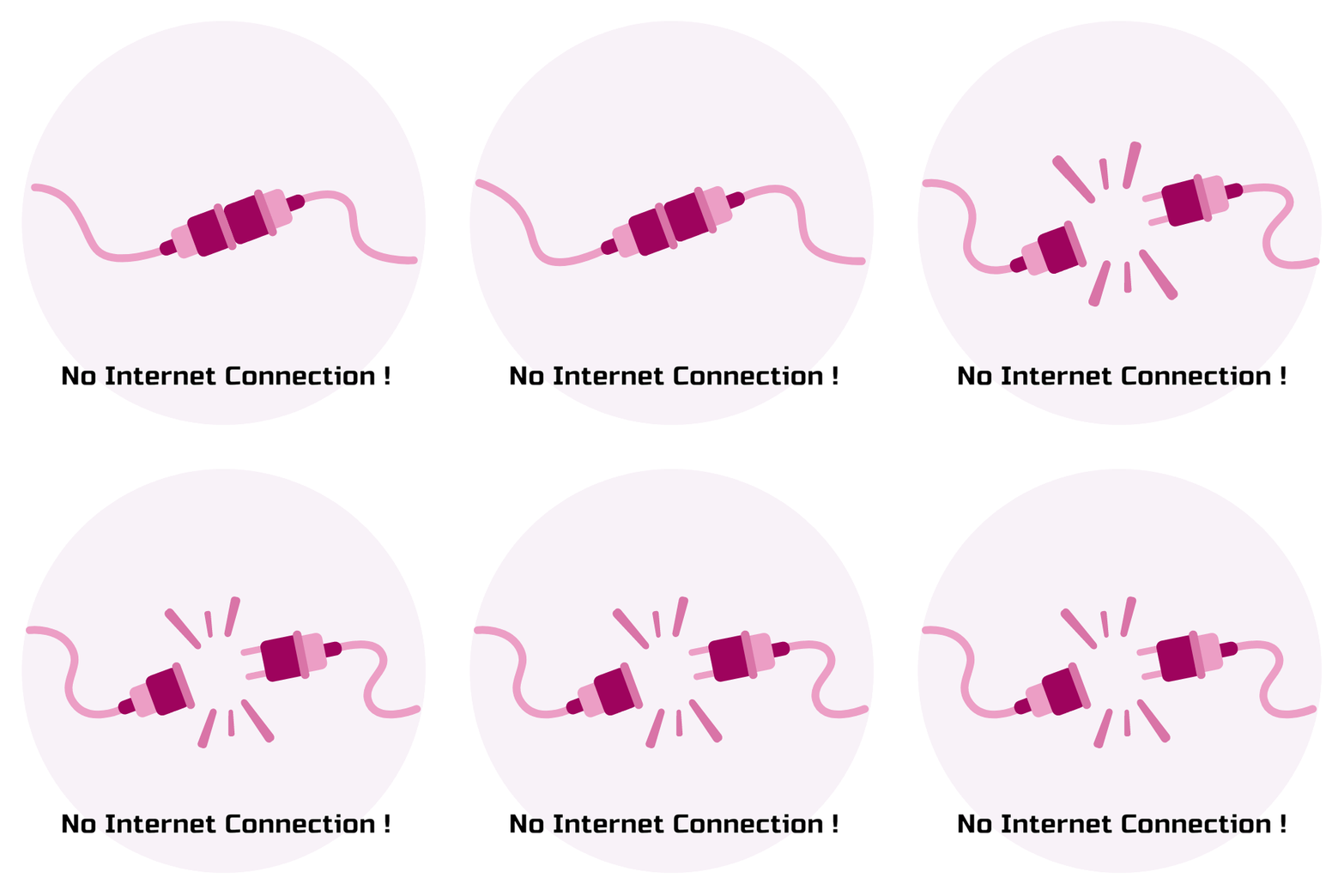
Error states are not only important when passwords are forgotten and internet connections go down. Even in a world of 4G and ultra-fast broadband, designers should plan for slow loading from the start.
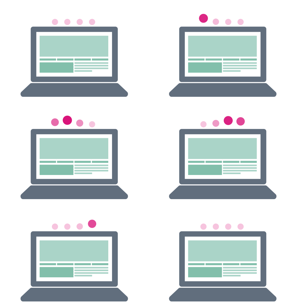
To make a platform appear like it is doing some work whilst users wait for it to load, we design skeleton screens with ghost components to ‘fill the gap’. This isn’t a new concept but, like the error states, it’s often overlooked as something that can be customized in the design stage to improve the user experience.
Airbnb for example uses a simple skeleton of their results to indicate to the user something good is on its way. It makes the wait experience more enjoyable by giving a teaser of what’s to come. The ‘save’ icon in the top right of each result and the carousel button on the edge of the container are visible, even whilst loading. This is training the user to understand the layout before they even see the live data. There’s often an opportunity here to guide your audience on what you want them to click or see first, even before seeing any content.

Managing expectations is a big part of the design process, and providing an indication of the result of an action and how long it is going to take will always be good feedback for the user. If we change the environment they are in with a smooth transition using ghost content, we are helping their brain to adjust and process new information, as well as training them on the architecture of the page. It’s about considering the user journey before the user even knows they are on board.
- Please wait… still loading...
The majority of users now expect an app to refresh by dragging down from the top of a feed — they see a generic loading icon and know what it means. Now that this has become intuitive, it’s important to incorporate it into familiar environments so the behaviour doesn’t have to be taught again. It saves time for users and for designers.
Generic loading icons will always be important in digital platforms as they reassure a user that their desire for action is being taken seriously. How can we push this UX further when loading and transitioning between screens?

It’s easy for designers to forget about the transitions of pages as they load and what the user sees when they are waiting. The above example from Fabulous, a daily motivation & planner app, shows a full takeover loading screen. This is a great option when you want the user to feel like you have done a lot behind the scenes, as it gives the feeling of a journey from A to B. Fabulous provides a nice UI to keep users interested, as well as clever UX writing to keep them informed.
- Make the most of haptics
There are some obvious differences between designing websites and apps, and one of the biggest things we see not being used to its full potential in app design is haptics — interaction involving touch.

On websites, we can get clever with hover states to make the user’s experience more enjoyable, and make it blindingly obvious what is clickable. As we’re unable to track users hovering digits on mobile and tablet devices, we need to give them the same experience using haptic technology.
We see pressed states as the app version of hover states. We don’t know where the user is thinking of going, but once they press a component we can give them the same experience. We now have the ability on some devices to incorporate functionality based on how forceful or long their press was.
This is lower on the checklist because it can’t be used to show the user what is clickable in an app — they need to know that from the UI beforehand. But once they have pressed, designers should think about how a user knows the app has recognized an action.
The pressed and dragged states in the material design system are a great example of how the user is able to see that their touch has been recognized. The detection of where the user clicked, shown by the placement of the circle, makes the experience feel trustworthy and elegant.
When we are creating design systems, we should start with the most simple interactions and see if they can be improved for the user in each instance. If a user clicks a button and it doesn’t work, at least with a pressed state they get some visual feedback that it isn’t their fault.
Wrapping up,
This UX pain point checklist is almost always something we get to when all of the key flows are designed, the screens are tidy and my layers are named and organized (read more about the importance of version control here).
UX pain point checklist:
- No results
- Error states
- Loading screens
- Pressed states
A lot of the above will be designed once problems are found in user testing. If you are designing a product, it might be implemented after an MVP has identified user friction. It’s okay to prioritize the functionality and basic UX flow when designing, but I’m starting to like the challenge of creating the ‘nice-to-haves’ along the way.
Humans are not always paying attention. As designers, we like to think users will love our products and rave about every little detail. In reality, most of the time, they use them without thinking. Users have a job to do and just want to do it as quickly and efficiently as possible.
Want to receive regular updates on Product design, Web design, UI/UX?
SUBSCRIBE to our newsletter Today!


.webp)


